|
|
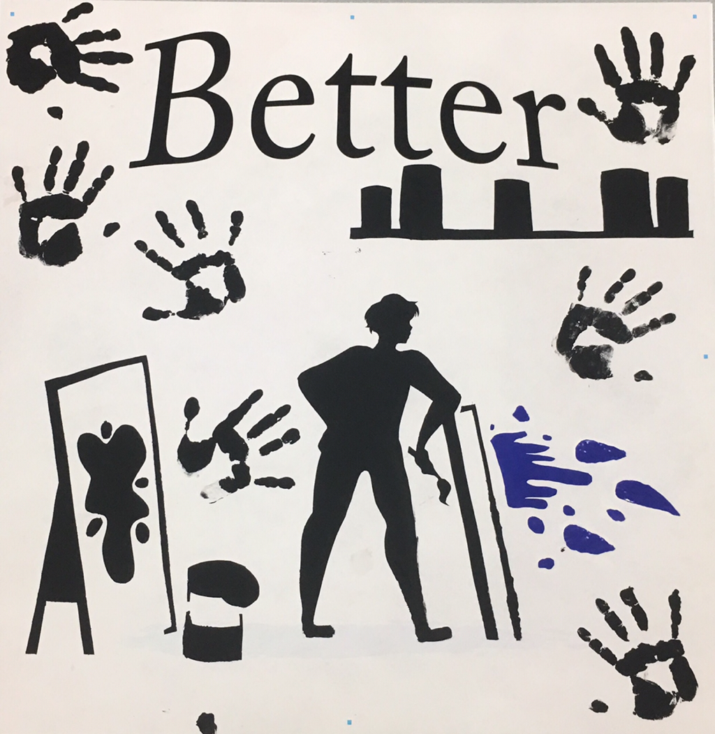
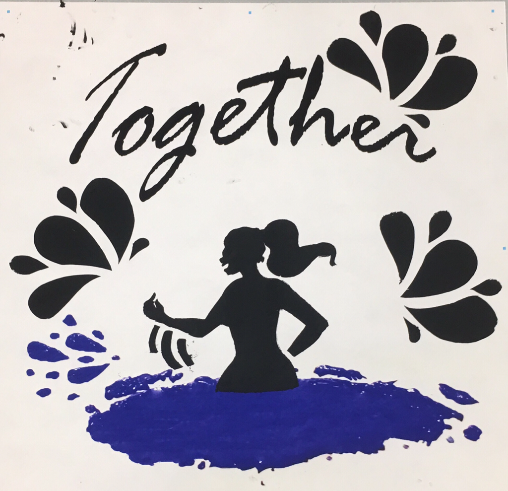
Title: Better Together
Medium: Acrylic Based Ink on Tyvek
Size: 3 ft x 3 ft
Exhibition Text:
In most social constructs, most of what we do is set to be our own business. What I do is my business, and what you do is yours. However, a lot of what we fail to realize is when we come together, we can make some extraordinary things possible. Although messy, and chaotic, in it's own way it has its own meaning and beauty. Beauty is in the eye of the Beholder. It's whether or not you wish to bring them together to embrace it. The reason I decided to put these two together [on one page] is because that is how it is meant to be displayed. Without each other, they are almost meaningless.
This piece was inspired by Matisse and Robert Longo.
| Critical Investigation |
"Better together" was inspired by the union of communities and people. However, when researching artists, I wanted to get more of a physical beauty rather than my previous ideological one. I wanted something that would Pop, and something that was more simple. A couple stood out. First was Matisse with a couple of pieces, them being Icarus (1947) and Blue Nude (1952). I was drawn to them because of their bold figures, and their cooler toned colors. I wanted to replicate some of the bold color aspect of what I wanted to do, so that my message would pop. Another Artist that inspired "Better Together" was Robert Longo, and his "Men in the Cities" Series. I wanted to incorporate more dynamic and defined figures in my work, something I lack. So I wanted to draw inspiration from someone who had these sorts of figures in their work, and thus came Longo.
| Inspiration |
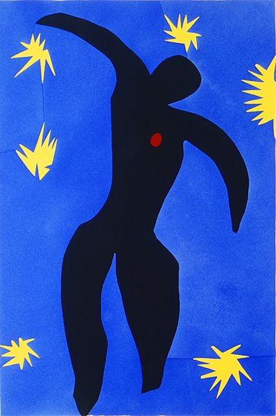
Henri Matisse, Icarus, 1947. (Published 2018) Retrieved from https://www.metmuseum.org/art/
collection/search/337069
|
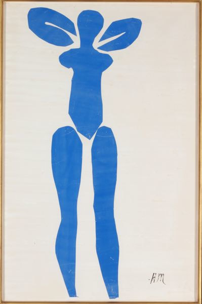
Henri Mattise, Standing Blue Nude, 1952 (Published 2018) Retrieved from https://www.metmuseum.org/art/
collection/search/492813
|
Henri Matisse was born in Le Crateau in Northern France in 1869. He experimented and worked in all Media, from painting, to sculpture, and even printmaking. In his later years, when the inspiration pieces were made, he was bedridden after surgery.
However, not letting it stop him, he would have assistants put up paper on the walls and have instruments of art on a long pole, and would work from bed. How Matisse inspired me was through his use of bold colors and figures. Since the beginning of his fruitful career, he maintained these figures in his work. Even if the public viewed them as bland, I can see some dynamics in them. The Run in Icarus and Lean in Blue nude. |
|
Robert Longo was born in Brooklyn, New York in 1953. He was an artist who was a master in his craft for the three dimensional craft in a 2-D space. For example, Longo uses his drawing skills to create images like the squirming or dancing figures in his "Men in the Cities" series.
This specific series inspired me because of how defined and dynamic his poses are. You can see every fold in the white button-ups, the shade differences in skin, ect. But since I was working with Silk Screen, I really wanted to try and get more of a line of action, a curve if you prefer, that the eye can follow. These are easily seen in the pictures from the series to the right. |
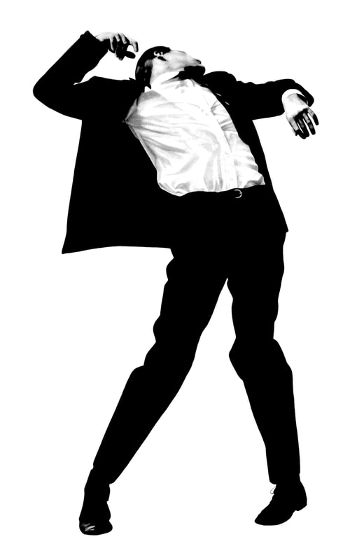
Robert Longo, Untitled from the "Men in the Cities Series", 1980 (Published 2009) retrieved from https://www.robertlongo.com/series/
meninthecity/
|
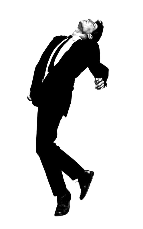
Robert Longo, Untitled from the "Men in the Cities Series", 1980 (Published 2009) retrieved from https://www.robertlongo.com/series
/meninthecity/
|

Robert Lenz, People's Flag of Milwaukee, 2016 (Published 2018) Retrieved from https://milwaukeeflag.com/history/#overview
|
I was also slightly inspired by the Symbolism of the People's Flag of Milwaukee. I wanted my piece to also have deep meanings like the flag designed by Robert Lenz for a contest to determine a new City Flag for Milwaukee.
The Gold represents the Breweries in Milwaukee, the White disc being the Sunrise over Lake Michigan and Peace, The three teal Stripes being the three rivers in Milwaukee, and the Dark Blue being the waters of Lake Michigan. The Symbolism in the simple design and colors really inspired me. Especially the importance of Water in the Milwaukee community. |
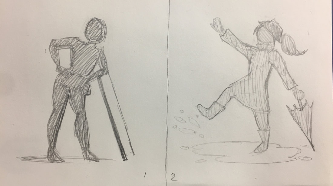
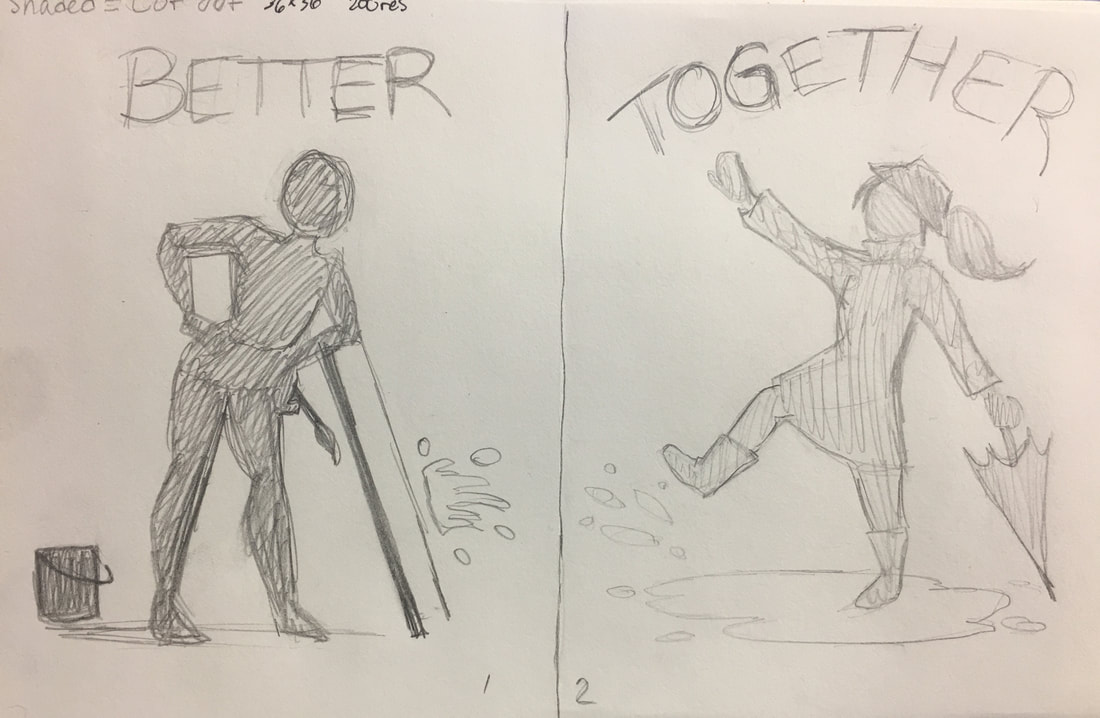
| Planning Sketches and Photos |
|
Pose References Modeled By Mekdese Woldemariam and Maysa Saadeddin.
|
|
|
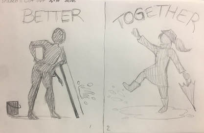
My Planning Sketches are overall the same, but I wanted to fiddle around with the idea of filling in more empty space by adding (meaningful) text and the small paint can.
I also wanted to have some meaning with the elements in the sketches, and final piece. Overall, the two together symbolize the artist community, and how often Artists can work together or need help from others to get an amazing product. The Puddle the female on the second piece will be blue, and represent the waters and rivers in Milwaukee, and how often we interact with water. The male Figure on the First piece represents the proud Artists and Art Program we have at Reagan. The blue splat is also supposed to look like it is coming from the puddle of paint, again connecting the two together. The Text is also Important, since not only are they physically better together, but we are all better when we work together. |
|
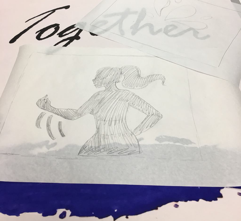
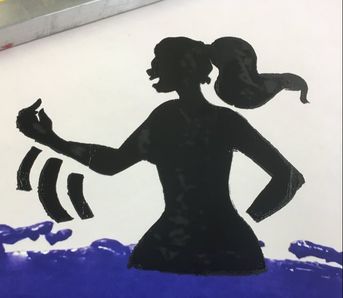
Later on, However, while making stencils, I decided to change the Together Stencil. I decided to change it to a woman splashing the water, to more accommodate the Great Lake Michigan we interact with often.
A Critique I had gotten earlier was that it was harder to connect the rain with Milwaukee, so I instead went for a woman splashing water with her hand rather than in the rain. |
|
| Process |
|
First I started my Planning sketches. I wanted to get down my ideas first and tried to get down everything I wanted before I did anything else. This is critical so that I can accurately plan backgrounds, especially in Print one, since there were going to be many stencils used.
|
|
|
|
After I had the Sketches, I got a large paper and took my blue bottle of paint and created a blob of paint to replicate the lake in my second background. After I get the image, I took to Photoshop and Upped the brightness, bleached the hue and saturation, and added text. And to make the other background, I photo shopped the blob of paint out, and added different text.
Next I took Freezer Paper and with the wax side down, I drew on my stencils. I used both my reference photos and planning sketches to draw the stencils out. Once Done, I grabbed a scrap board and an exact-o knife and started to cut along the lines I drew on the tracer paper. I repeated this on each of the stencils.
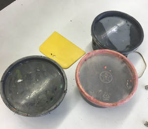
When we got to MIAD, the first thing we did was grab ink, a screen, a spoon, and a squeegee. I Grabbed a couple cups of black ink, so I could completely cover my stencils on the screens.
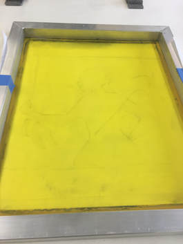
|
The next thing I did was place my stencil where I needed on my Tyvak, and then the screen on top. I quickly taped the stencil on and replaced it. Once it was placed, I started to plop down ink on the screen along the top of the screen. Once I got the ink on there, with even pressure I took the squeegee and pressed down the screen. Once I was done, I set the squeegee aside and pulled the screen up to show the finished print. Rinse and repeat with the rest of the stencils.
|
|
Overall, I would say that I captured most of what my inspiration had conveyed. However, I wish I would have captured more of a dynamic posing in these prints. However I really wish the prints could have been larger so I could have covered more of the Tyvak with the prints, especially in the second Tyvak, or "Together".
| Reflection |
My main goal and theme of Better Together was to make the audience realizes how important community and working together is. Because of that goal, I pushed to make my project as full of symbolism as it could be. Because of that, I think this project would be a success for the most part. While creating Better Together I noticed many weaknesses as much as I did strengths. For example, actual printing of the stencils was fairly simple to do overall, since I had done it before. Another strength was creating the stencils, it was fairly simple because I had patience and a keen eye for where and how I wanted things cut. There were also some complex or tougher things in the project such as collecting the ideas and symbolism, and getting the dynamic poses I wanted. The dynamic poses were tough and frustrating for me purely because of how hard it is to replicate human anatomy for me in art. But, I, overall feel that this project turned out exactly as I had hoped. I feel like I need to really get more comfortable with screen printing since I struggled with it in the beginning. But, again, I feel like I succeeded.
| ACT Questions |
1. Clearly explain how you are able to identify the cause-effect relationships between your inspiration and its effect upon your art work?
My inspirations have affected my artwork by having a meaningful physical affect on my work. Longo affected more of the physical forms in the art while Matisse affected the colors.
2. What is the overall approach (point of view) the author ( from your research) has regarding the topic of your inspiration?
The authors really went in depth about the history of the artworks rather than the meaning of the works. With the author for Matisse for example, they focused a lot of the physical aspects and history of the works.
3. What kind of generalizations and conclusions have you discovered about people, ideas, cultures, etc. while you researched your inspiration?
I have discovered that many people - especially in the past - really focused on themselves, rather than a while community with one another.
4. What was the central idea or theme around your inspirational research?
Mainly my theme was social issues and constructs. Artists with strong world views seem to inspire me.
5. What kind of inferences (conclusions reached on the basis of evidence and reasoning) did you make while reading your research?
Life is unforgiving and treacherous for anyone and everyone. War and Discourse is just part of society and not much can be done about it since it has been around for so long. But sometimes instead of keeping to ourselves, we need to work together to complete things.
Citations:
“Henri Matisse.” Biography.com, A&E Networks Television, 28 Apr. 2017, www.biography.com/people/henri-matisse-9402564.
“Icarus, Plate VIII from the Illustrated Book, ‘Jazz.’” Metmuseum, Metmuseum, www.metmuseum.org/art/collection/search/337069.
“Men in the Cities.” ROBERT LONGO, www.robertlongo.com/series/meninthecity/.
“Robert Longo - Biography.” RoGallery, RoGallery, rogallery.com/Longo/Longo-bio.htm.
“Standing Blue Nude.” Metmuseum, Metmuseum, www.metmuseum.org/art/ collection/search/492813.
